What Is a Color Scheme?
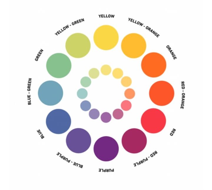
A color scheme consists of a combination of colors used in a range of design projects, from fine art to interior design to graphic design. Each color scheme consists of one or more of the 12 colors present on the color wheel.
By pairing different colors with each other, you can create endless color palettes to use in any composition. Different color combinations can also evoke different moods or tones through clever use of color theory and color psychology.
Color theory fundamentals
At the core of color theory lie the primary, secondary, and tertiary colors:
Primary colors: Red, blue, and yellow are primary colors. These are the basic colors that can’t be made by mixing other colors together.
Secondary colors: When primary colors are mixed together, they produce secondary colors. The secondary colors are green (blue + yellow), orange (red + yellow), and purple (red + blue).
Tertiary colors: Tertiary colors are created when a primary color is mixed with a secondary color adjacent to it on the color wheel. Examples include red-orange, yellow-green, and blue-violet.
What Are the Different Types of Color Scheme?
Color schemes can include any variety of colors you wish, but to avoid color clashing or unwanted psychological effects (yes, that’s right, the wrong color scheme can even make you feel ill or anxious), there are tried-and-tested types of color scheme to help you create the right color palette every time.
The main types of color schemes are:
- Monochromatic Color Scheme
- Complementary Color Scheme
- Split complementary colour scheme
- Analogous Color Scheme
- Triadic Color Scheme
- Tetradic colour scheme
- Neutral Color Scheme
Each of these color scheme types are built on rules of how different colors relate to each other on a color wheel, a format of categorizing the color of light first formulated by Isaac Newton.
The color wheel is a scientific way of observing how white light splits into a spectrum of light, allowing us to see exactly how colors are ordered in the world around us.
With this in mind, we can use these color scheme types as a scientifically proven method for judging which colors sit alongside each other harmoniously when we build color schemes for design projects.
1. Monochromatic Color Scheme
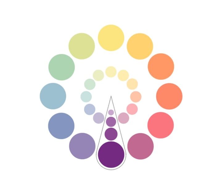
IT focuses on a single color, often using variations of that hue by incorporating its tints, tones, and shades. By adding touches of white, gray, or black, that single color can be expanded into a comprehensive color palette.
Those tints, tones, and shades also provide highlights and shadows to bring depth to an otherwise flat color palette.
A monochromatic color scheme is extremely versatile and easy on the eye. Using many hues in a design can often lead to a clash in colors and obstruct the design’s appearance, while simply using the color variations of one hue helps to simplify a design.
Colorful monochromatic schemes are a fun way to tap into the colourful minimalism trend which swaps neutral colors for variations of a more eye-popping hue, such as yellow, purple or aqua
Indeed, monochromatic color schemes are increasing in popularity due to the rise of minimalism in all aspects of design, from interior design to packaging and website design. This type of color scheme also allows for greater clarity of content or important information on websites or advertisements.
2. Complementary Color Scheme
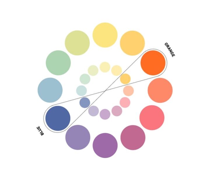
Complementary colors sit opposite to each other on a color wheel. One color is usually a primary colour and the other a secondary colour The main complementary color pairings are typically blue and orange, red and green and yellow and purple.
Colors sitting opposite to each other on the color wheel provide high contrast when paired together, bringing interest and intensity to a design. At full saturation, complementary hues can be extremely vibrant, so moderate the intensity by incorporating tints, tones, and shades to extend the palette and make it more palatable for a wide range of projects.
Alternatively, you can embrace the high contrast and intensity of this type of color palette by using a complementary scheme for attention-grabbing designs, such as website landing pages, app designs, or sales promotions.
When used successfully, complementary palettes can make a huge impact on a design. The unexpected pairing of a warm and cool hue provides eye-catching impact.
At first, using complementary schemes can be overwhelming but, with a little experimentation, you’ll be pleasantly surprised with the results.
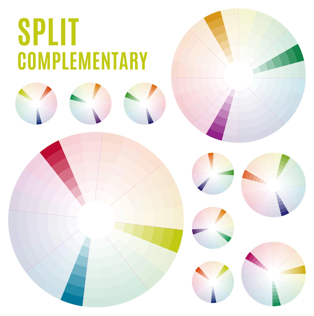
3. Split complementary scheme
A split complementary scheme consists of one prominent color and the two colors adjacent to the complementary color. This results in a more diversified color palette than a complementary color scheme while maintaining the benefits of contrasting colors.
The split complementary color scheme can be hard to balance since the colors used all create contrast — similar to the complementary scheme.
Also, you should know that the split complementary color model has both positive and negative aspects. The upside is that you can use any two colors in the scheme and achieve great contrast.
4. Analogous Color Scheme
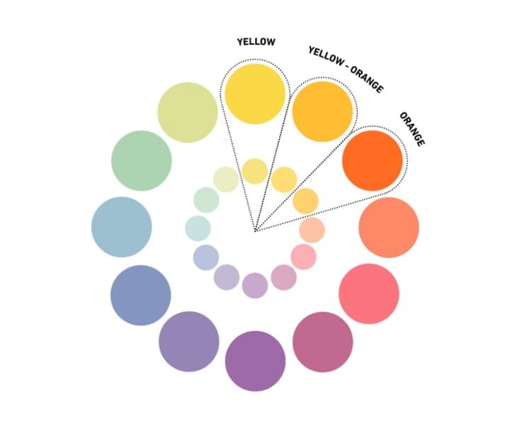
Analogous colors consist of a group of three colors that border each other within the color wheel. This type of color scheme starts off with a base hue and is extended using two neighboring colors.
The word “analogous” means closely related, so the combination of these hues has a harmonious appeal similar to that of monochromatic color schemes.
Enabling designers to create a gently graduating color palette, analogous color schemes are often used for their easy-going, calming nature. There’s nothing jolting or unexpected about an analogous color scheme, making them a perfect choice for projects that require a soothing scheme.
If you need analogous color inspiration, take a look around you. Analogous palettes are often found in nature, from warm sunsets and oceanic waves to the jewel hues of peacock feathers.
Try an analogous color scheme that incorporates blue, teal, and green or look to orange , yellow , and lime for a warm yet soothing color palette.
5. Triadic Color Scheme
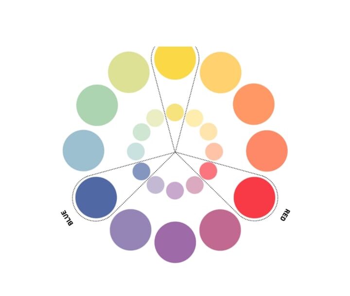
A triadic color scheme consists of three colors that are placed equidistant from each other on the color wheel, forming a triangle, as seen below. Triadic color schemes can include three Primary, secondary or tertiary colours.
Common triadic palettes consist of blue, red, and yellow or violet, green, and orange.
Most triadic palettes are vibrant, contrasting, and can be difficult to balance. A good place to start is to assign one base hue, then use the remaining two hues as accent colors.
When all colors in a triadic scheme are being used equally, each hue often fights for the spotlight, so a good way to prevent a clash of colors is to establish color hierarchy within the composition.
For example, in an interior design project , one of the triadic colors can be used as a dominant color in a larger area of the room, such as a painted wall or sofa. The other two colors can then be used to bring in pops of color on smaller items, such as lamps or artwork.
As with the other types of color scheme, try to avoid using all three colors in their fully saturated state if you still want to maintain a sense of calm and balance.
6. Tetradic Colors (Rectangle)
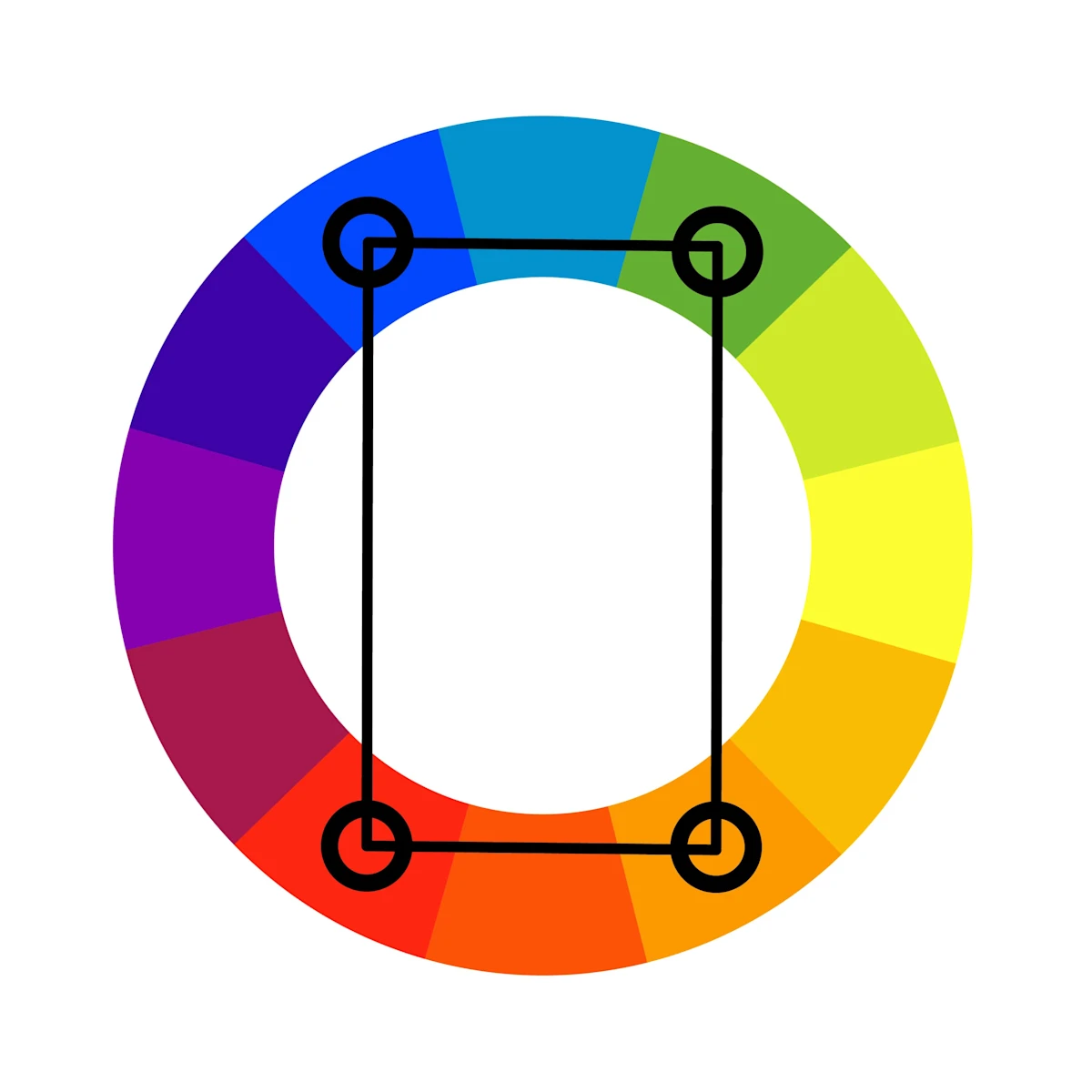
A tetradic color scheme is similar to a triadic color system. The key difference is that we’re forming a rectangle on the color wheel, instead of a triangle. Using the example of green again, we can draw a straight line to orange. Then, on the other side of the wheel, we’d like a line of identical length. Then we’d connect the two with shorter lines.
This would connect green and orange on one of the longer lines. The longer line on the opposite side would link red and blue. The smaller lines would alternate between blue and green, and red and orange.
The biggest difference between this color combination and previous ones is the sheer number of colors to contend with. Four color selections give your brand color palette a much wider range of hues and tints to contemplate.
It’s recommended to choose one of the four colors to be the main color in your design. Balance is also required to guarantee that the emotional impact of the color selections is consistent.
Tetradic color combinations can be seen in brands such as Google, eBay, Slack, and Microsoft.
7. Square Color Schemes
Square color schemes, a versatile and dynamic approach to color harmony, are becoming increasingly popular in 2024. This scheme involves selecting four colors evenly spaced around the color wheel, creating a balanced and visually engaging palette. Here’s a detailed look at the latest trends and practical applications for square color schemes:. There are 4 colors in this scheme one key color. Having 3 equidistant colors from the key color gives two complementary pairs which forms a square.

8. Neutral Color Scheme
It have recently gained momentum across many design disciplines, including interior design, fashion, and product packaging. This popular color scheme typically consists of achromatic hues (white, gray, and black) along with near neutrals (beige, tan, brown, and other dark hues).
All neutral colors have one thing in common—they’re typically desaturated with the help of tints, tones, and shades.
A neutral color scheme can fit a variety of applications and mediums—the neutral, minimal aesthetic has found a place amongst brand designs, stationery, interior decorating and across social media.
The great thing about this type of color scheme is that it’s hard to go overboard with colors but, as a rule of thumb, try sticking to four hues or less. You can boost the visual power of neutral colors by focusing on bringing in texture to your designs.
While other color schemes use the strength of a color to draw interest from a viewer, neutral schemes allow more visual space for other elements to shine, such as tactile background texture,detailed illustration, or a strikingly simple font.
Much like monochromatic color schemes, neutral color palettes evoke a sense of calm and serenity. Desaturated tones are easy on the eye and don’t fit within a specific trend, making them a versatile and timeless choice for a wide range of projects.
Try a neutral color palette on breezy beauty packaging or as part of a minimal interior design scheme to create a mood of freshness and simplicity.
In colour science, a color gradient (also known as a color ramp or a color progression) specifies a range of position-dependent colours usually used to fill a region.
In assigning colors to a set of values, a gradient is a continuous colormap, a type of colour scheme. In computer graphics, the term swatch has come to mean a palette of active colors.
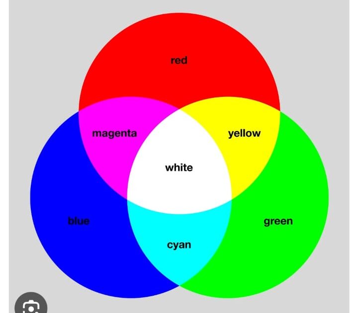
The RGB color model is an additive colour model in which the red, green and blue primary colours of light are added together in various ways to reproduce a broad array of colours. The name of the model comes from the initials of the three additive primary colours, red, green, and blue.
The main purpose of the RGB color model is for the sensing, representation, and display of images in electronic systems, such as televisions and computers, though it has also been used in conventional photography and coloured lighting. Before the electronic age, the RGB color model already had a solid theory behind it, based in human perception of colours.
When one of the components has the strongest intensity, the color is a hue near this primary color (red-ish, green-ish, or blue-ish), and when two components have the same strongest intensity, then the color is a hue of a secondary colour (a shade of cyan, magenta or yellow). A secondary color is formed by the sum of two primary colors of equal intensity: cyan is green+blue, magenta is blue+red, and yellow is red+green. Every secondary color is the complement of one primary color: cyan complements red, magenta complements green, and yellow complements blue. When all the primary colors are mixed in equal intensities, the result is white
The RGB color model is based on the Young -Helmholtz theory of trichromatic color vision developed by Thomas Young and Hermann van Helmholtz in the early to mid-nineteenth century,
HSL and HSV are the two most common cylindrical – coordinate representations of points in an RGB colour model.
Developed in the 1970s for computer graphics applications, HSL and HSV are used today in color pickers, in image-editing software, and less commonly in image analysis and computer vision.
HSL stands for hue, saturation, and lightness, and is often also called HLS. HSV stands for hue, saturation, and value, and is also often called HSB (B for brightness). A third model, common in computer vision applications, is HSI, for hue, saturation, and intensity.
